
Website & Brand
Erriot Wood Pumpkins
Who…
Erriot Wood Pumpkins are a ‘Pumpkin Patch’ located in Lynsted which is just outside Gillingham and nestled in the picturesque Kent countryside. They offer Pumpkin picking for family fun during October.


the Issue
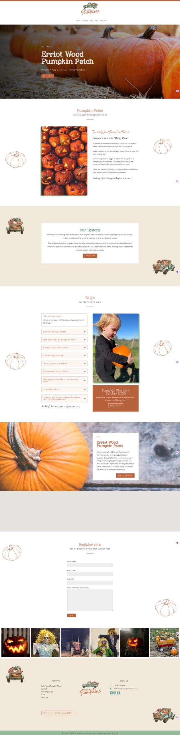
I was asked to create a one-page website and brand for Erriot Wood Pumpkins who wanted a website for their venture.
the Solution
The project for Erriot Wood Pumpkins entailed the creation of a comprehensive one-page website and a distinctive brand identity, both of which were carefully designed to encapsulate an American theme. The primary components of this project included:
Website Design: The centrepiece of the project was the one-page website. It served as the online gateway for potential visitors to Erriot Wood Pumpkins. The design of this website was focused on several key elements:
Visual Theme: The American feel was at the forefront of the design. This meant incorporating imagery and colour schemes that resonated with the essence of rural America. The use of earthy tones, wooden textures, and vintage elements like the old American truck played a significant role in creating this atmosphere.
Content Structure: As a one-page website, it needed to be concise and engaging. The layout was carefully structured to guide visitors through essential information, including opening hours, activities, pricing, and location.
Imagery: High-quality images of the pumpkin patch, pumpkin picking, and family fun activities were prominently featured. The old American truck in the logo was also showcased to reinforce the theme.
Brand Identity: The brand identity encompassed several elements, with the most prominent being the logo:
Logo Design: The logo, featuring the old American truck, was the cornerstone of the brand identity. It symbolised the heart of Erriot Wood Pumpkins and gave the brand a unique visual signature. The design of the logo needed to be versatile, ensuring it could be used on various promotional materials.
Colour Palette: The colour palette was carefully selected to complement the American theme. Warm, earthy tones, such as deep reds, rustic browns, and golden yellows, were likely used to evoke a sense of nostalgia and warmth.
Typography: Typeface choices were made to align with the brand’s character, likely reflecting a balance between a classic, timeless aesthetic and readability.
Consistency: Maintaining a consistent American theme was crucial throughout the project. This meant that the design elements, colour schemes, and imagery used in the website and brand identity needed to harmonise seamlessly.
Overall, this project aimed to create a captivating online presence for Erriot Wood Pumpkins that celebrated the spirit of American pumpkin picking. The combination of the one-page website and the distinctive brand design, with the old American truck as the focal point, contributed to a compelling and memorable representation of the pumpkin-picking experience in Lynsted, Kent, with an authentic American twist.
” We are so happy with our new website and brand, Yvette at Lemonade Design Co, captured the brief exactly and the website was delivered very quickly, we’re very happy “
Karen – Erriot Wood Pumpkins
back to Projects
More Projects
you might like…
Why not view a few more projects that I’ve done for other photography clients, or if you would like a chat why not book a call


