This Is Feeling: Wedding Photographer Website Redesign
THE CLIENT
Client: Ben, This Is Feeling
LOCATION
Chicago, USA
websitelink
There’s something quite special about redesigning a website you originally created. You already know the business. You’ve seen how it’s grown. And you can spot exactly where it’s ready for its next chapter.
That was exactly the case with Ben’s website, This Is Feeling.
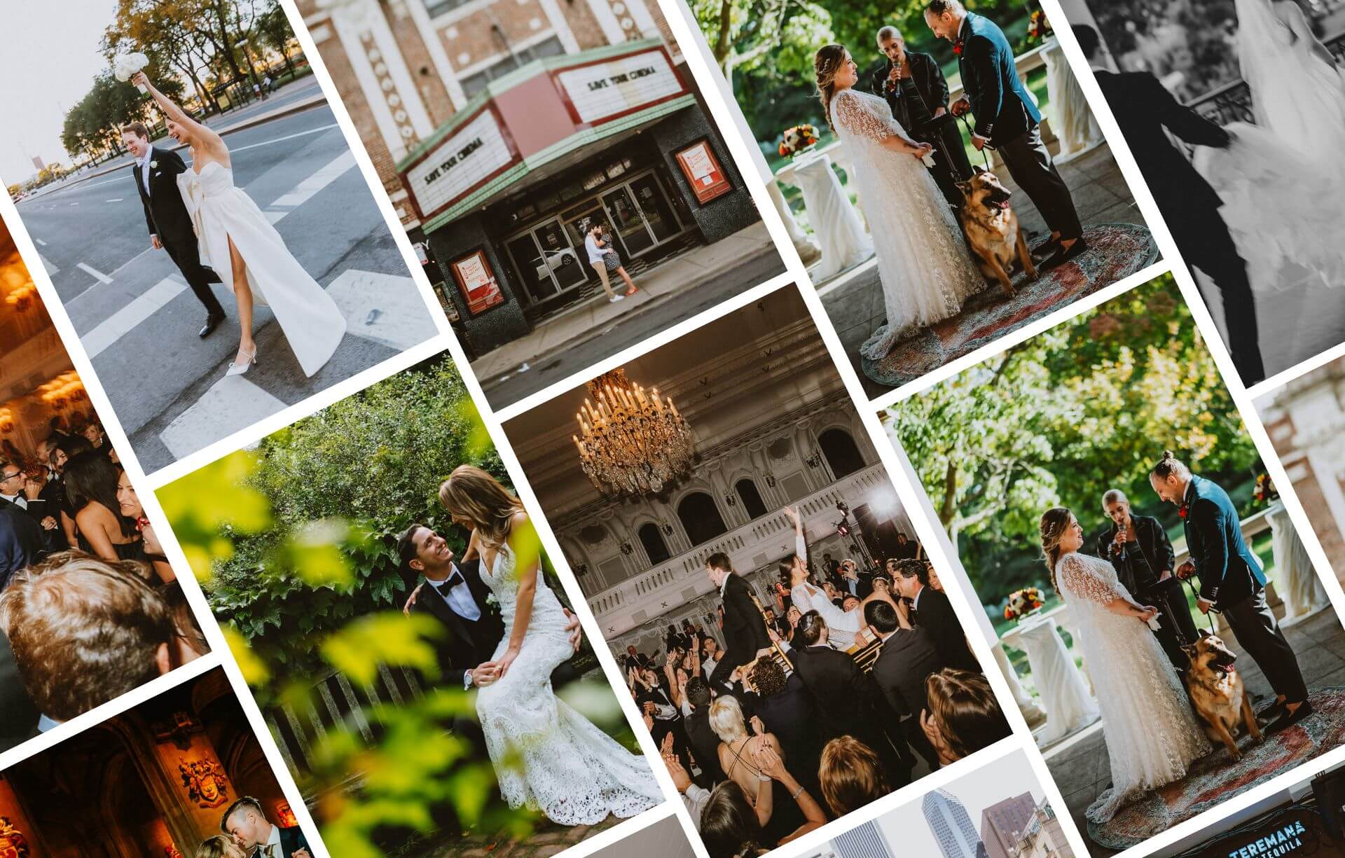
I first designed and built Ben’s original Divi website back in 2018 for his photography business in Chicago. And honestly, it had stood the test of time incredibly well. Six years is a long lifespan in website terms, and it had supported his business beautifully.
But as any creative evolves, eventually your website needs to catch up with who you’ve become.
And this time, it wasn’t just about a refresh.
It was about creating something that truly reflected Ben’s work today.
When a Website Refresh Becomes Something More
Ben had been toying with the idea of updating his website since November 2023. Like many photographers, he knew things had shifted. His style had refined. His work had deepened. His brand had matured.
But it wasn’t until he completed my discovery questionnaire that everything became clear.
His answers didn’t describe a simple refresh.
They described a completely new direction.
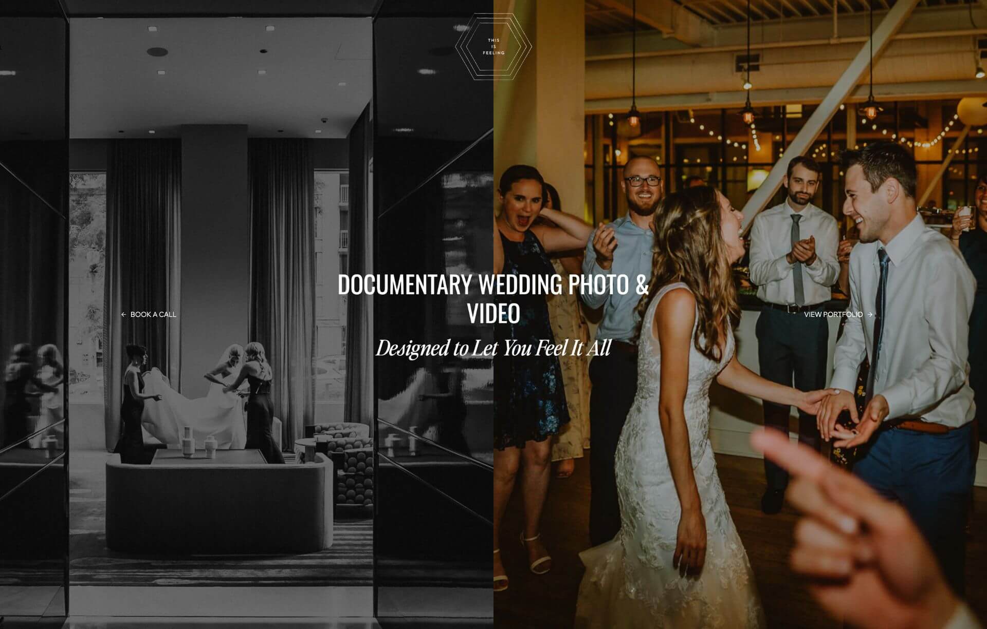
He also shared a Showit website he loved. It had that beautifully minimal, editorial feel. Lots of breathing space. Elegant typography. Emotional storytelling. The kind of website that lets the photography do the talking.
At that point, it was obvious.
This wasn’t a tweak. This was a rebuild.
Fewer Pages. Fewer Clicks. More Impact.
One of the biggest shifts Ben wanted was actually quite simple.
Less clicking.
His original website had grown over time, with more pages added as his business evolved. But the downside of this is that visitors often had to work harder to find what really mattered.
And in today’s world, attention is short.
If someone has to click through multiple pages to understand your work, you risk losing them before they ever enquire.
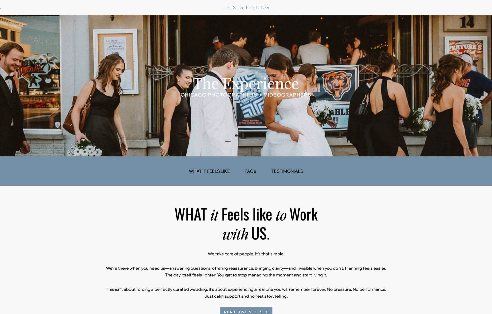
So with the new This Is Feeling website, we simplified everything.
We reduced the number of pages.
We combined content where it made sense.
And we created a smoother, more intentional journey where visitors can quickly see his work, connect with it emotionally, and take the next step.
The result feels calmer, more confident, and far more aligned with his brand.
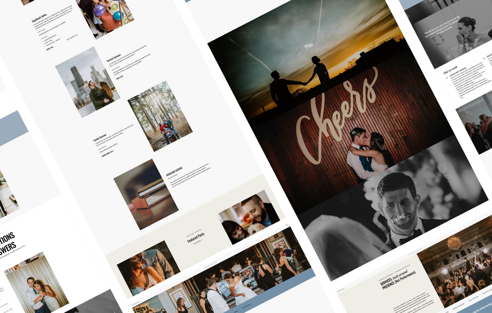
Why We Chose Kadence Instead of Showit
Showit websites are undeniably beautiful. But they’re not always the best long term choice for every photographer, especially when performance, flexibility, and ownership are key.
Because Ben’s original site was already on WordPress, I recommended building his new website using Kadence.
This meant we could recreate the same high end look and feel he loved, while keeping all the benefits of a fast, flexible, SEO friendly WordPress website.
With Kadence, we achieved:
And importantly, a website that feels like him.
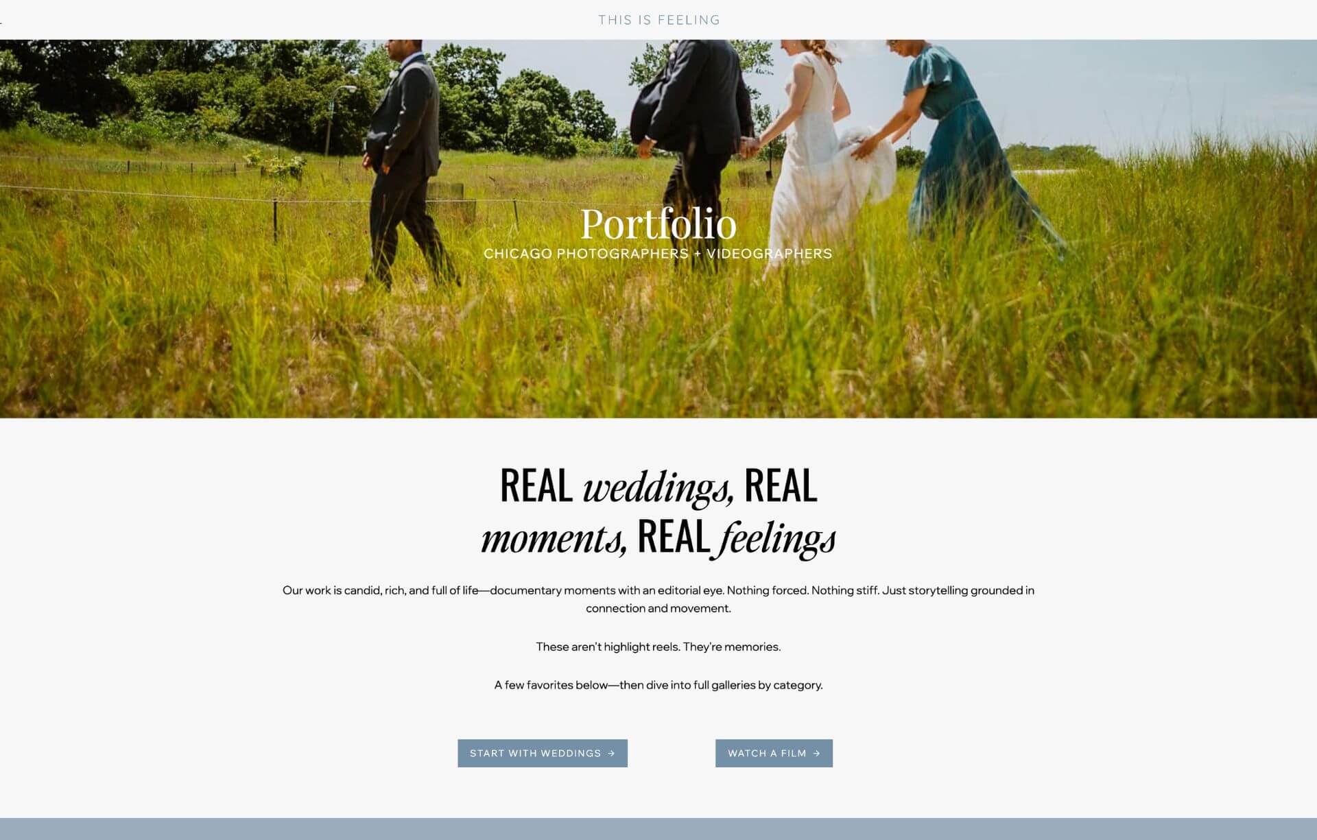
Designed Around Emotion, Not Just Information
Ben’s photography has always been about emotion. About presence. About real moments.
So the new This Is Feeling website was designed to support that.
We created space for his images to breathe.
We simplified the structure.
We removed unnecessary friction.
Because when someone lands on his website, they shouldn’t have to work to understand his work.
They should feel it immediately.
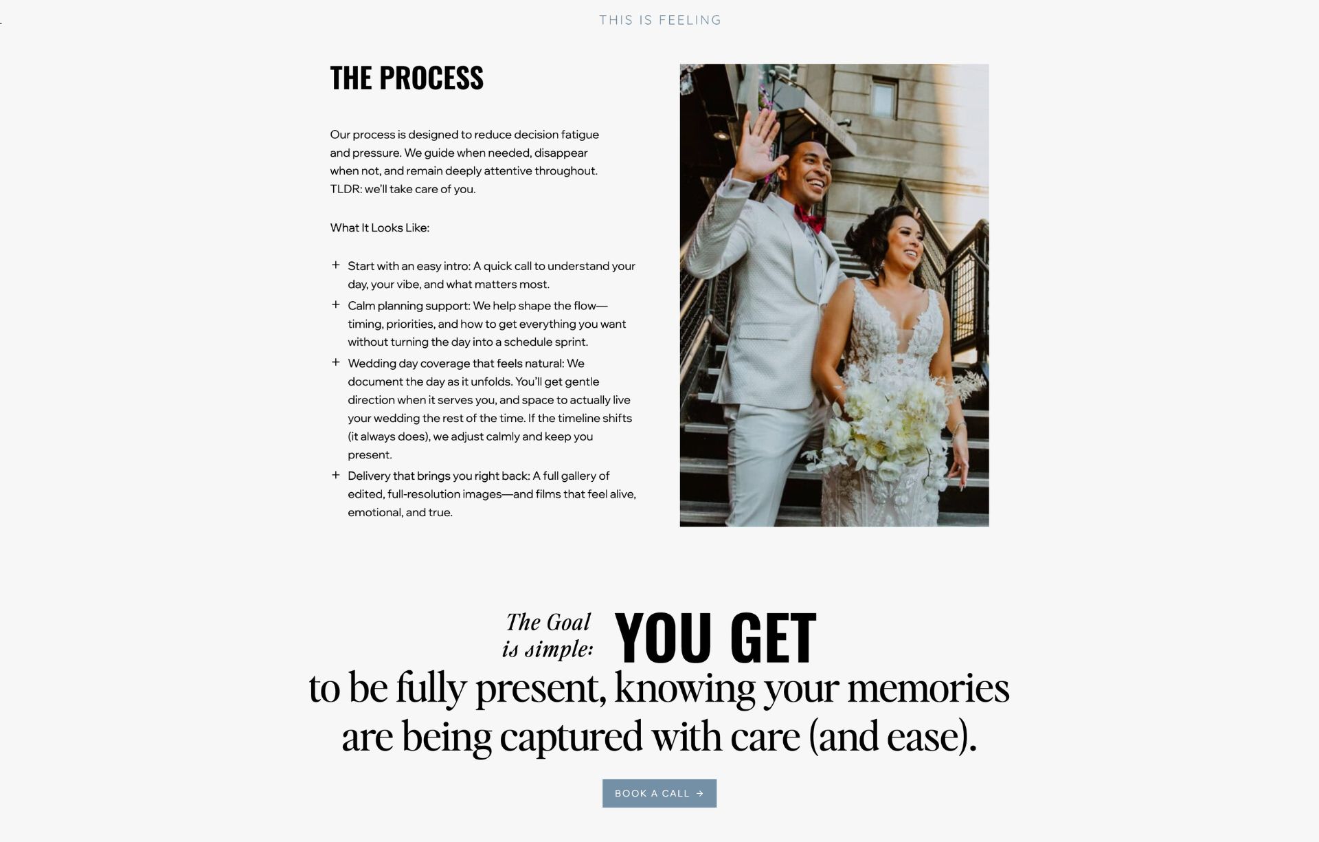
From a 2018 Website to a 2026 Brand Presence
This new website positions Ben exactly where he should be.
Not where he was in 2018.
But where he is now.
Confident. Established. Refined.
His new Kadence website now reflects the quality of his work and the experience he offers his couples, with a simpler structure, fewer clicks, and a much stronger emotional connection from the very first scroll.
And just as importantly, it gives him a platform that will grow with him for many more years to come.
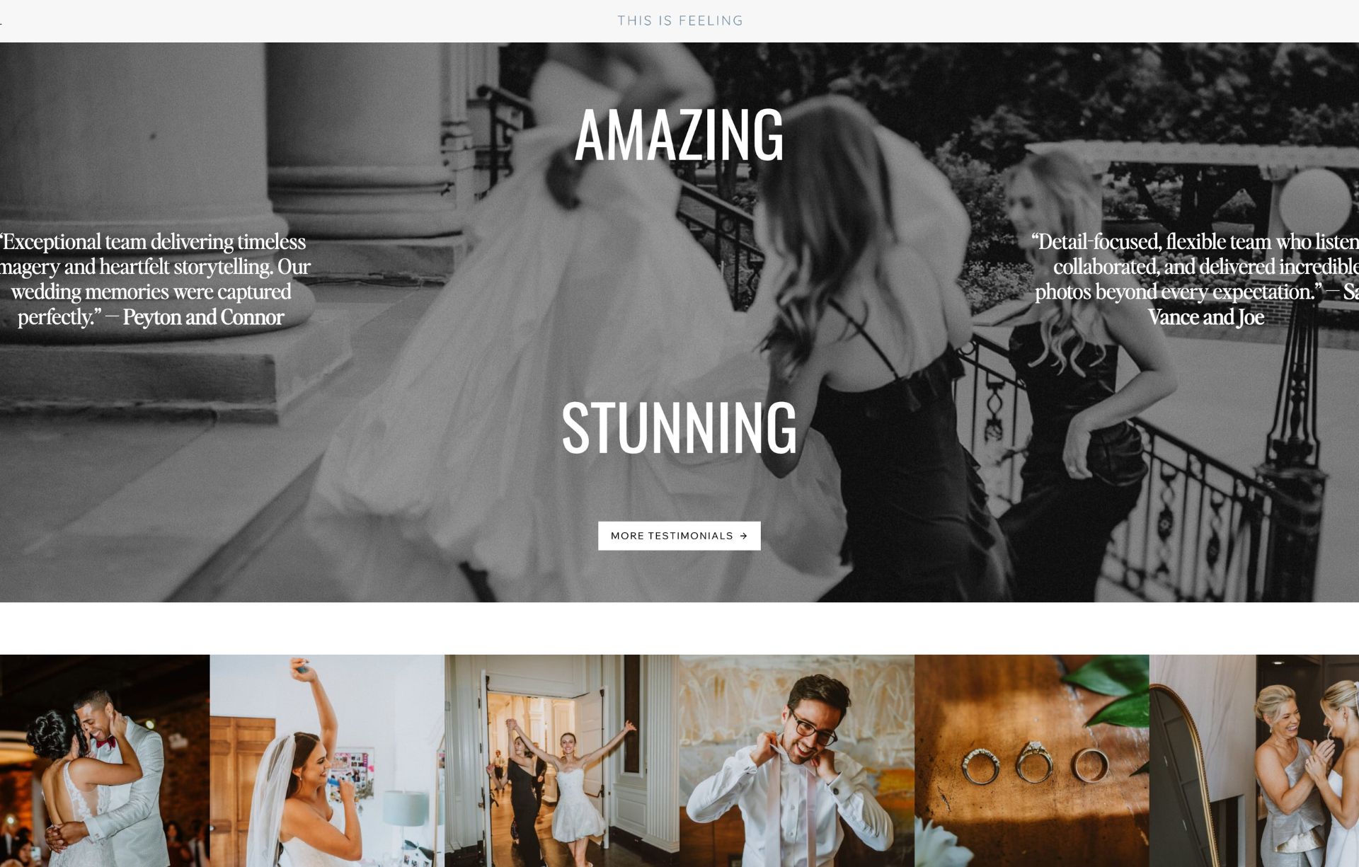
Is Your Photography Website Ready for Its Next Chapter?
If your website is more than four or five years old, it’s worth asking yourself one simple question.
Does it still reflect the level you’re working at today?
Because often, your work evolves faster than your website does.
And when that happens, your website can quietly start holding you back.
Ready for a Website That Finally Feels Like You?
If you’re a photographer and your website is starting to feel a little behind where your work is now, you’re not alone. Ben’s previous site had done its job beautifully for years, but as his style evolved, it was time for his online presence to reflect the level he was working at today.
Your website should make it easy for people to connect with your work. It should guide them effortlessly, without endless clicking, and leave them with that quiet confidence that they’ve found the right photographer.
If you’re ready for a website that feels more aligned, more intentional, and built to grow with you, I’d love to help.
Whether that’s a full redesign or a strategic refresh, we can create something that reflects your work and supports your next chapter.
Or book a Free 30 Minute Call and let’s chat about what’s possible.
Yvette